Applying Fitts’ Law To Mobile Interface Design
Fitts’ Law is an essential principle of Human-Computer Interaction theory that was formulated almost 60 years ago. It’s critical to UX design for the desktop and laptop, but with interaction techniques being vastly different on mobile devices can we still use it the same way? We’ll look at what Fitts’ Law consists of and how it is applied to design on mobile devices.
To discover how we use Fitts’ Law we must first look at exactly what it is and its original, intended use. It was created in 1954 by Paul Fitts and intends to model the act of pointing at a target on a computer monitor. Surprisingly, it was also designed to account for both hand and mouse actions.
For example: imagine your mouse cursor and attention is focused on the logo of a given website. You’re then compelled to click a call to action, so you turn your focus to the button in question. The efficiency of this movement from one position to another is what Fitts’ law aims to pin point.

This is the raw formula:
MT=a + b * log2(D/W + 1)
MT is the movement time it takes to move between two spots, which is what we’re trying to figure out. Variables a and b are the intercept and slope, respectively, which are usually determined experimentally. D is the distance between the origin and the target. W is the width of the target. With all that said, it’s rare to see a UX practitioner use this formula in its raw form since there are simpler applications that stem from this formula.
The basic idea that comes from Fitts’ Law is the farther away a target is and the smaller its size then the more difficult it is for the user to correctly land on that target. Of course, while this has to be balanced against other UX considerations, it should be part of the UX toolbelt.
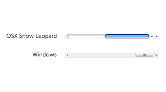
Take for instance scroll bars on Windows versus the Mac (pre OSX Lion). Windows has the up arrow at the top of the scroll bar and the down arrow at the bottom, likewise with left and right. This format tries to lean more into the mental model of looking up for up and down and for down. The Mac however puts the arrow buttons side by side because, due to Fitts’ Law, navigating between them is much quicker in that format.
In the UX world, the user base must be taken into account at all times and Fitts’ Law is no different. It’s correct application becomes even more important for those with limited motor skills such as children, the elderly and the disabled. Targets need to be even larger to aid in the success of the user pointing at the target.
Fitts’ Law Applications for Desktops
Size and Distance
Size and distance from the most common interactions should be considered when designing any UI element with which the user interacts. There are many different design guidelines out there but most come with a minimum button size and distance from other interactive elements. It’s also important to account for high risk interactive elements that you don’t want the user to accidentally activate. Those should often be kept further away from heavily used interactive items.

Edges
- Corners - As the mouse cursor stops at the edge of the screen, corners can be considered to have an “infinite” width. The user needs much less precision because they can simply fling the mouse in the direction of a corner and the limitations of the screen restrict where the pointer ends up. This is partly why you see the windows start menu and the Apple menu in the corners of your screen.
- Top and Bottom - Similarly, the top and bottom are easier to access due to screen limitations. These are not as easy as corners because they are only limited vertically, but still allow for quicker access than a point in the middle of the screen. This is why Apple always place application menus at the top of the screen instead of at the top of the application window.


Menus
- Pop-up Menus - Popping menus at the location of the cursor helps reduce travel distance thereby creating a smaller movement time. You see this in items such as right-click menus and flyouts.
- Pie Menus - Pop-up pie menus create close proximity with the added benefit that the menu items are closer to the cursor. So why don’t we see a lot of pie menus? Frankly, because they are difficult to design well and are not often part of standard UI libraries.
Fitts’ Law and Mobile
We need to look at the two main types of mobile devices separately because the interactions differ enough to warrant discussing them out independently. Here we’ll refer to the phone as the 3.5 inch screen and the tablet as the 7 inch screen. It is acknowledged that those measurements aren’t universally true across all devices, they’re used for the sake of discussing size and hand movements in this article.
Another key difference in mobile is that there are different orientations and ways to hold the devices. For all intents and purposes, mice are all held and used the same way. There are differences in trackpads and such, but they don’t change the interaction in terms of Fitts’ Law the same way that mobile does. We’ll explore this in each device section.
The design pattern used with corners and edges also applies to mobile but in a very different way. Unlike the desktop, your fingers are not limited to the corners or edge of the screen. This no longer allows the infinite width rule to apply. However, we’ll examine why edges and corners are often still used on mobile.
Thumb Zones
The use of thumbs is a common interaction on mobile devices. There are times when the thumb is not used, but when we’re using our thumb we have to consider that the original Fitts’ Law formula applies only within the range of motion of our thumb. The problem occurs when an item falls outside of that zone. It then requires an additional effort that Fitts’ Law does not account for and adds an additional variable that increases movement time. We need to keep this in mind when discussing the effects described below.
Fitts’ Law and The 3.5 Inch Screen
Vertical Orientation
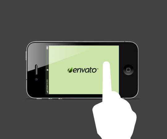
Let’s first look at the vertical orientation since that is the most commonly used orientation for a 3.5 inch screen. While I don’t want to fixate on Apple, they do some very smart things behind the scenes that most people don’t even realize enhance usability. The iPhone is the exact size it is so that the average thumb can reach every portion of the screen. Imagine if on your desktop you could only move your cursor 3/4 of the way up the screen and then you had to grab the mouse with your other hand to move it the rest of the way. Obviously, this throws a kink in Fitts Law and increases movement time significantly.
As Interactive Designer Josh Clark points out there are reasons for the positioning of certain elements. iPhone menus are placed at the bottom due to the way our thumb bends along with the fact that our thumb is already covering that area because of the way that we hold the phone. The top corner opposite the hand your holding the phone with can require a little extra effort and stretching for many hands. As stated above, this adds an additional variable in Fitts’ Law that increases the movement time. The motion between two targets is no longer a fluid, resistance-free motion.
Common thumb reach when held with right hand.
Android uses a different tactic and places the menus at the top. This is not without cause. Android phones have their operating system menu at the bottom of the phones; they purposely place on-screen menus at the top to avoid accidentally clicking the wrong menu items.
One guideline derivative of Fitts’ Law is to place high risk targets (close, delete, etc.) away from highly used targets in order to help prevent user error. With iPhones this can sometimes be accomplished at the top of the screen. Yet, 3.5 inch screens are small and finding an area the user could always avoid can be difficult. That’s why there are tricks like the “swipe left to delete” that takes a longer time to accomplish but help avoid accidental triggering of high risk actions.
Horizontal Orientation
In the horizontal orientation, the left and right edges of the screen become more important if we’re trying to minimize movement time. The other issue is that the user often has to use both hands in this orientation. They can be used simultaneously so in some cases we may be able to decrease user time by essentially having Fitts’ Law performed in two areas concurrently instead of in succession. The total movement time is the same but the user time is reduced.
Common thumb reach when holding smartphone in horizontal orientation..
Consequently, the middle of the screen becomes more difficult to reach, especially the extreme top and bottom of the middle. Again, this requires additional stretching which adds an additional variable that increases movement time. This area should be reserved for actions that are either rarely used or are high risk actions.
Hold and Point Method
There is another state where the user holds the device with one hand and uses the index finger of the other hand to point. In this mode the finger stretching doesn’t become an issue. However, many users that use this mode handicap themselves to just that finger. This is not ideal for activities such as typing and some games.
Hold and point mode (gesture icon by gesturecons.com)
Fitts’ Law and The 7 Inch Screen
Vertical Orientation
In Josh Clark’s “Designing For Touch” article he also points out that most people hold their tablets at the top of the device. Therefore the top two corners become the most important zones to place actionable targets. In my experience, I’ve seen many people hold it at the bottom. This is especially true for typing when users have the iPad’s split keyboard turned on. In this case the bottom corners would be the most important zones, except when typing is needed.
Horizontal Orientation
Tablets can be held by one hand vertically with relative ease, but horizontally it is a bit more of a challenge. The bulk can increase the proclivity to drop the device. Therefore if tablets are being held in a horizontal orientation it is almost always a two-handed operation. We also need to keep in mind that one side typically has a home or menu buttons on the device so that side has even less space for the thumb to operate on the screen.
“Docking” Mode
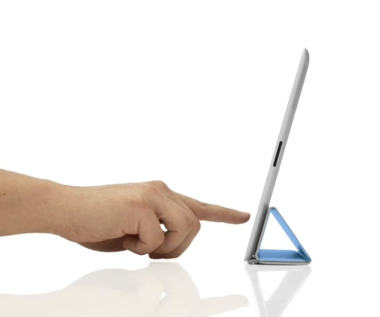
All the above is dependent upon tablets being held, but because of the tablet’s size and bulk it is often in a “docked” mode. This is not to say that it’s plugged in but that it’s often placed on our laps, desks or tables. The new iPad case that folds back to create a small stand makes this even more true. This allows for more pointing on the tablet than on the smartphone. Therefore design is not as restricted to the thumb zones and expands our original Fitts’ Law equation to the entire touch surface.
Seamless Switching
It’s important to remember that switching modes and orientations happens often for users. Users will switch modes without even thinking, going to the most convenient for the activity they are performing in the moment. Now, there is some delay time for going between vertical and horizontal so that switch is not quite as seamless. The point remains that we certainly need to design with the points above in mind, but it’s not as if users are locked into any particular mode or orientation. We need to be cognizant of the mode and orientation the user will likely be in for a given activity/action and design with that in mind.
Conclusion
Orientation and how the device is held or stationed becomes critically important in our designs. Fitts’ Law can be affected in various manners and in order to design for optimum UX it’s important to know how. Fitts’ Law is certainly not the only, or even most important design consideration, but it’s almost always a good starting point. There are certain challenges we face on mobile that we don’t have with the desktop. With mobile growing as fast as it is, these considerations should be a standard weapon in the UX repertoire.