Well Designed Mac App Websites
To a Mac user, the difference between one application and the other is, in part, how well it is represented. Even though several useful applications have simplistic sites, in the vast sea of websites that we have today, looks make a difference. The sites showcased here have incredible designs – they command attention and present their apps in the most compelling way. Below, you will find 30 alluring Mac app websites that will hopefully cook up some inspiration and get some of those creative juices flowing.
TextExpander
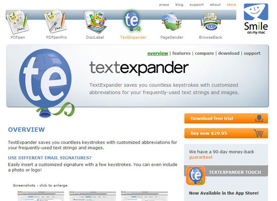
The TextExpander site is simple and informative. It displays an easy to find (and use) navigation menu that aids visual cognition with representative icons. The site contains organized content and skips the jargon.
Coda
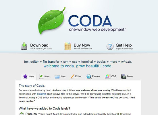
Coda’s site uses a few jQuery animation functions to "wow" its visitors. It has a slider in the middle of the layout that you can navigate through by using its tabs or the arrows on either side.
Eclipse
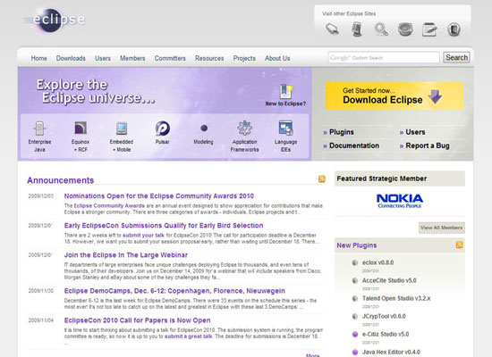
This site features several of Apple’s trademark colors with a dash of their own creativity. The content is well spaced and doesn’t seem crowded. The only critique I have would be that the sidebar should’ve been equal in width to the gray area in the feature section. By aligning those two page elements, it would make the layout look more harmonious.
Billings 3
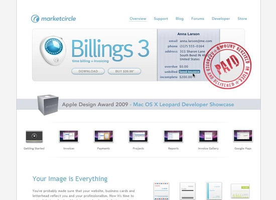
The Billings 3 website displays a header that gets straight to the point. Using modal windows (sometimes referred to as lightboxes) for the thumbnails in the main page is helpful for displaying many images that are close to each other. All of the elements are spaced out on a grid, which makes the design more organized.
TaskMate
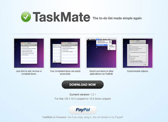
The colors TaskMate uses resembles those of Coda, however, the sites looks different. This site features a simple one-page layout that can almost be categorized as "half-a-page". It’s very straightforward, cuts to the chase, and has obvious examples for the user to choose from.
Merlin
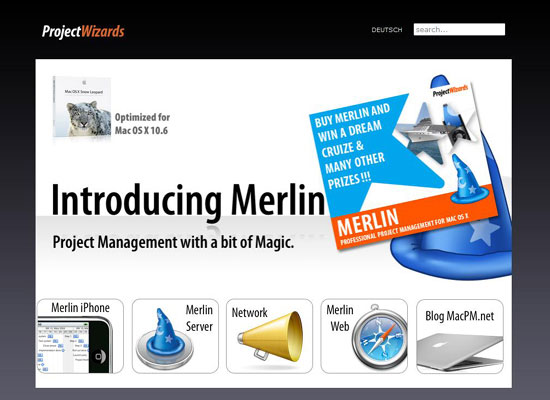
Merlin’s site focuses on usability and large images. Unlike several of the other Mac app sites, this website holds more than one page.
LittleSnapper
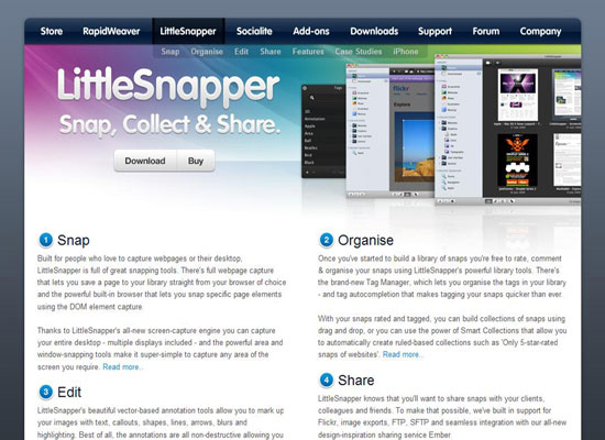
The LittleSnapper website is straightforward and gets to the point. The central theme focuses on the Mac style. With a large navigation bar at the top, this makes it easy for you to quickly switch between the different apps that they offer.
Fontcase
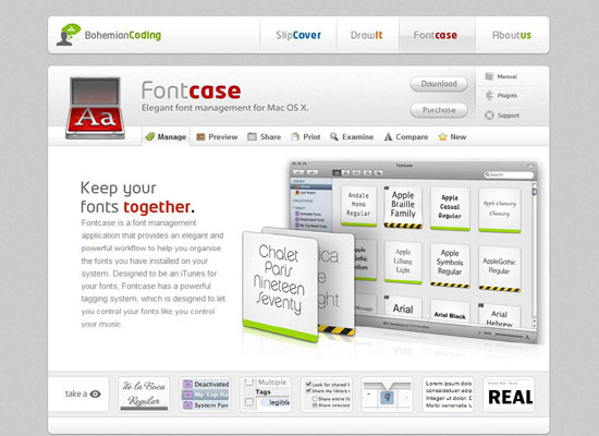
This Mac app site does a pretty good job at displaying content where it’s most needed. It gives you great examples, and has a whole section at the bottom of the site dedicated to screenshots. Now that’s effective communication.
Mac Rabbit: Expresso
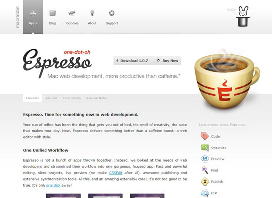
The Expresso site is more charming than most. It brandishes an attractive set of icons on the right sidebar to communicate to the user visually. It also has a clever logo that compliments the idea of this project.
iWeb
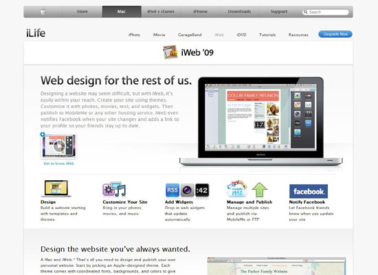
The iWeb site is embedded into the central theme of the mother of all Mac sites: Apple.com. What can one say except that this popular corporate website is well laid out, is crispy clean, and appreciatively engaging. The only thing I would change is the default font size, which seems to be too small. Other than that, it’s a great site design.
Pixelmator
![]()
Pixelmator uses a dark theme accompanied by small text. Besides that, the site beautifully divides the content and images. This saves it from looking excessively crowded.
BBEdit
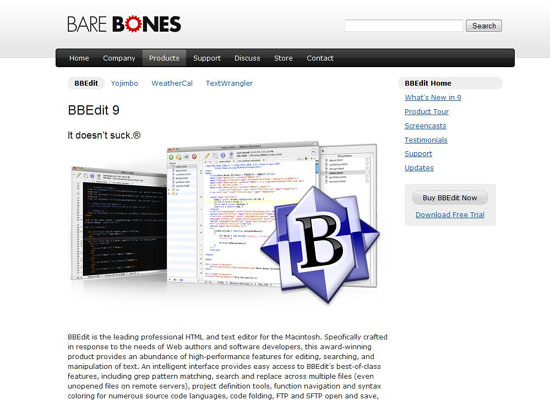
The BBEdit site exudes simplicity and a clean, minimalist layout. A design critique I have is that the design positions the download link of the app at a weak spot.
Slammer
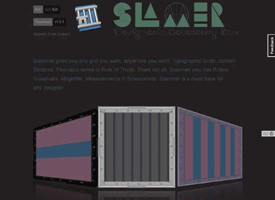
This is definitely a unique site when compared to other Mac app sites. Using a large dark background commands respect. The large headline at the top is a great way to make an introduction to first-time visitors.
Things
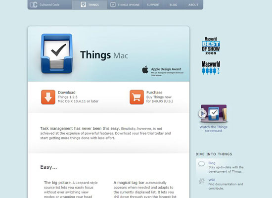
Things has one of the simplest and most content-driven sites in the world of Mac applications. The design features great icons and uses fitting default font sizes to make reading the content remarkably easy on the eyes.
FontExplorer
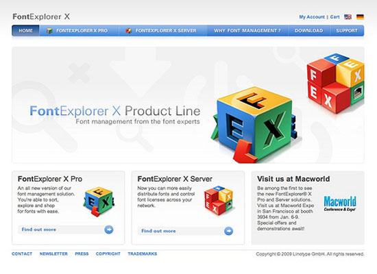
This site has more of a corporate look. It incorporates an easy to navigate menu bar, great usability, and properly spread out content.
Cocktail
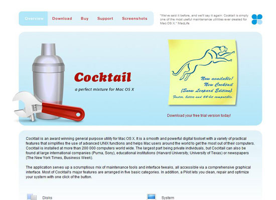
Cocktail grabs your attention with the large vector image in the header, and it makes good use of a simple design that’s focused more on how the content is delivered rather than displayed.
Magnifique
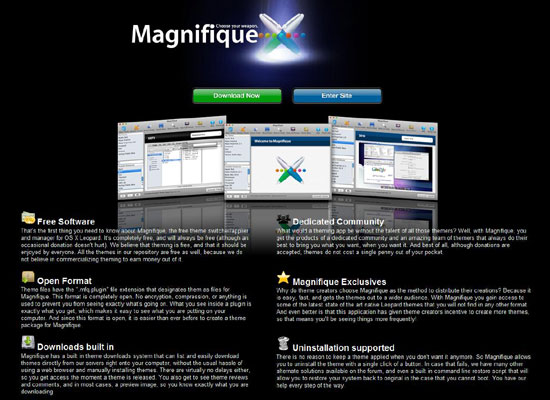
The entire site only gives you two options: learn about the software and its benefits and/or download it. Less is sometimes more, and in the case of Magnifique, that adage is truly applicable.
Jumsoft Money
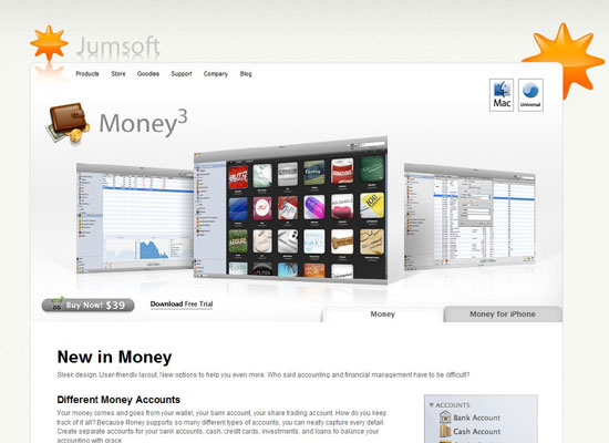
This is an easygoing site with good examples and great use of whitespace. In my opinion, the best design element this site has is its header; every time you visit a page (including the homepage), it sets you in the mood and speaks for what’s to come.
On The Job
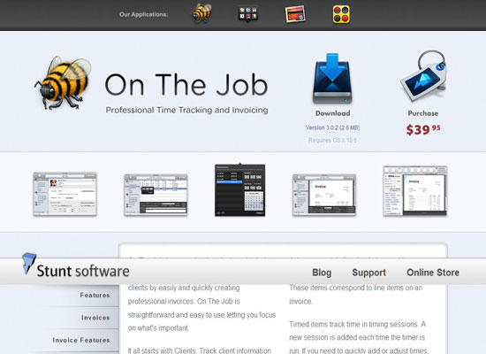
This is an amazing site with elements such as custom icons, a detailed logo, and very visible real-life examples in the form of images.
Versions
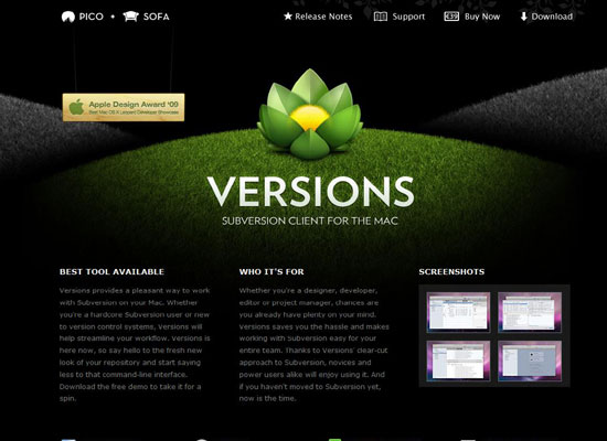
Versions is dark-themed site with great illustration. The Versions website is laid out on a grid system.
Snapz Pro
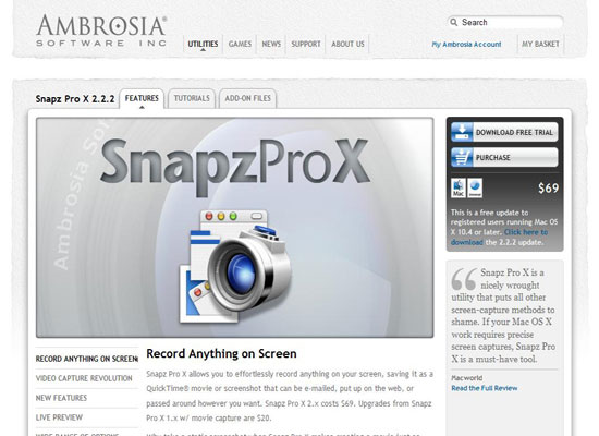
This site employs rough, worn elements to its design. Pages and other sections are easy to find and navigate. The icons used in the Snapz Pro website are also highly appealing.
rooSwitch
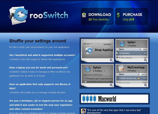
This site grabs your attention using a good mix of blue colors that mesh well together. The download button is large and will be hard for anyone to miss.
ScreenFlow
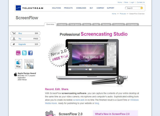
The ScreenFlow site consists of several elements that are well organized and are easy to get to. There aren’t any distractions or annoying disruptions for visitors.
Litmus
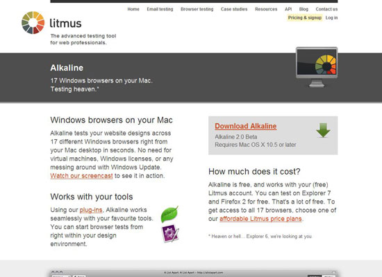
The Litmus site has several shades of gray. The site also uses much larger fonts and bigger headlines. This is ideal for those who wish to focus more on the features and benefits of their application.
Transmit
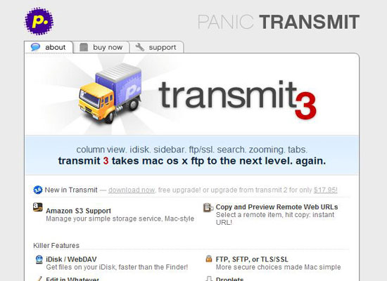
A well-designed site works with several other ingredients besides its look – and the Transmit site does just that. The layout is centered and small, however, it capably conveys information that it wants to share.
Fetch
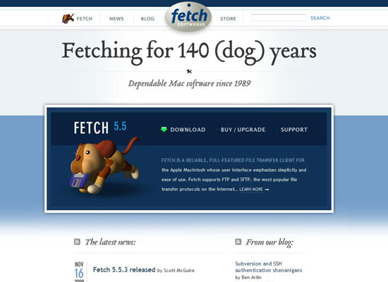
The Fetch site focuses on distribution of the app rather than content. The layout is clean and allows adequate amounts of "breathing room" between design elements.
Cornerstone
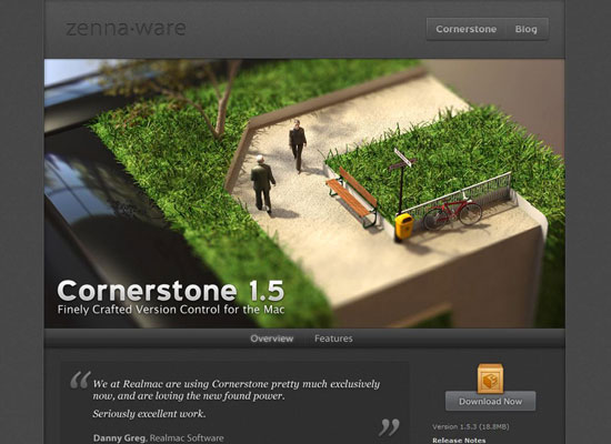
Cornerstone has a very nice web page that provides an arena of content with several examples.
Querious
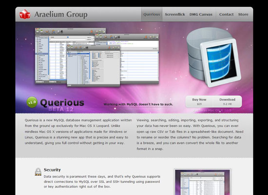
This is an amazing site with nice icons. It sports a fixed 2-column layout and a highly operational header that offers more than just examples and pretty illustrations.
Sequel Pro
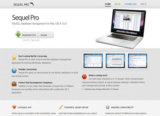
The Sequel Pro website is a well-organized site with a nice background and well-spaced-out content. The layout and color theme is reminiscent of the Apple site, and demonstrates the same design theme of tidy minimalism.
Synplicity
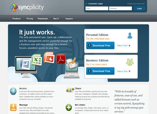
Synplicity has a great site with stunning illustrations. Whatever information you’re looking for, you will find in a matter of seconds. The design doesn’t look overly complicated, which is a good thing because visitors tend to go after the sites that are not only attractive, but offer simplicity as well.
Author Jarkko Laine