5 CSS3 Design Enhancements That You Can Use Today
3. Text Shadows
Supporting Browsers: Apple Safari 3, Firefox 3.0.5, Google Chrome 1
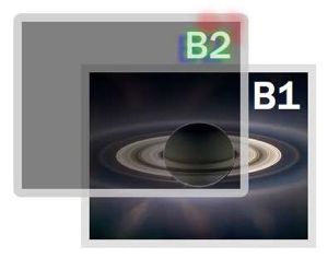
Add a shadow underneath any text, controlling the left/right and up/down offset, as well as the color:
text-shadow: x y blur color;
You can combine the text shadow with a transparent color to control the darkness of the shadow:
text-shadow: -2px 2px 10px rgba(0,0,0,.5);
You can also include multiple text shadows just by repeating the values separated by a comma:
text-shadow:   0 0 10px rgba(0,255,0,.5), -10px 5px 4px rgba(0,0,255,.45),
15px -4px 3px rgba(255,0,0,.75);
4. Box Shadows
Supporting Browsers: Apple Safari 4, Firefox 3, Google Chrome 1
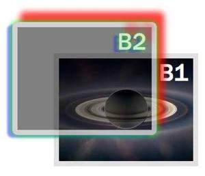
Adding a drop shadow to any box on the screen follows the same format as adding a text shadow:
box-shadow: x y blur color;
Just like text-shadows, Mozilla and Webkit have implemented their own vocabulary in advance of the final CSS standard:
-webkit-box-shadow: 0 0 10px rgb(0,0,0);
-moz-box-shadow: 0 0 10px rgb(0,0,0);
box-shadow: 0 0 10px rgb(0,0,0);
You can add multiple shadows just by including multiple values separated by spaces:
-webkit-box-shadow: 0 0 20px rgb(0,255,0), -10px 5px 4px rgba(0,0,255,.45),
15px -20px 20px rgba(255,0,0,.75);
-moz-box-shadow: 0 0 20px rgb(0,255,0), -10px 5px 4px rgba(0,0,255,.45),
15px -20px 20px rgba(255,0,0,.75);
box-shadow: 0 0 20px rgb(0,255,0), -10px 5px 4px rgba(0,0,255,.45),
15px -20px 20px rgba(255,0,0,.75);
5. Multiple Backgrounds
Supporting Browsers: Apple Safari 1.3, Google Chrome 1
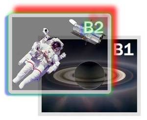
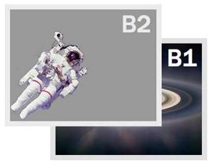
Including multiple background images in a single element simply requires additional sets of values to be added to the background properties, separated by commas. You should include a single background image as a back-up for other browsers:
background-image: url(astro-127531.png);
background-image: url(astro-127531.png),url(Hubble-112993.png);
background-repeat: no-repeat;
background-position: bottom left;
background-position: bottom left, top right;
SPECIAL BONUS
Rotate Anything!
Supporting Browsers: Apple Safari 4, Firefox 3.5, Chrome 1
Although not even a part of the CSS3 specification yet, Webkit has implemented its own transformation property, which Mozilla is following suit with. Transform can include a number of different value types, but one of the most intriguing—and useful as a design enhancement — is rotate:
-webkit-transform: rotate(-15deg);
-moz-transform: rotate(-15deg);
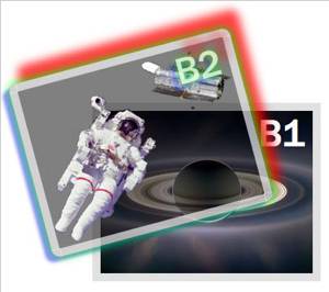
Appearance as seen in browsers that do not support CSS3 (e.g. Opera 9)
See the live working example (requires Safari 4+, Firefox 3.5+, or Chrome 1+)