Designing CSS Buttons
Buttons, whatever their purpose, are important design elements. They could be the end point of a Web form or a call to action. Designers have many reasons to style buttons, including to make them more attractive and to enhance usability.
Sliding Doors: Flexible Buttons
One important consideration needs to be made when styling buttons: scalability. Scalability in this context means being able to stretch a button to fit text and to reuse images. Unless you want to create a different image for each button, consider the “sliding doors” technique. This technique enables you to create scalable, rich buttons.
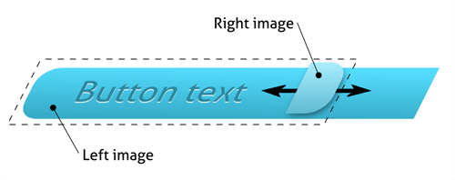
The principle involves making two images slide over each other, allowing the button to stretch to the content. Usually, this is done by nesting a span element within a link. As shown in the image above, each element has its own background image, allowing for the sliding effect. The two code snippets below show the structure and basic styling for this effect.
<a href="#"><span>Typical sliding doors button</span></a>
a {
  background: transparent url('button_right.png') no-repeat scroll top right;
  display: block;
  float: left;
  /* padding, margins and other styles here */
}
a span {
  background: transparent url('button_left.png') no-repeat;
  display: block;
  /* padding, margins and other styles here */
}
The advantages of this technique are that it:
- Is an easy way to create visually rich buttons;
- Ensures accessibility, flexibility and scalability;
- Requires no JavaScript;
- Works in all major browsers.
Useful Reading
The “Sliding Doors of CSS” article on A List Apart (part 1 and part 2) covers the basics of this technique. Although a bit old, these articles are a must-read for every Web developer.
Also a bit old, Creating Bulletproof Graphic Link Buttons With CSS is an excellent article that shows how to create bulletproof, resizable, shrunk-wrap buttons. Also a must-read.
Filament Group has a variety of excellent articles and tutorials. Its second article on CSS buttons, Styling the Button Element With CSS Sliding Doors,” explains how to create buttons by combining techniques. Although it doesn’t support the active state, it can be easily extended.
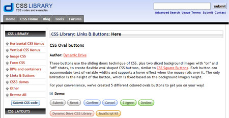
How to Make Sexy Buttons With CSS is one of the best and simplest explanations of the sliding doors technique. It also contains a little fix for the active state in Internet Explorer.
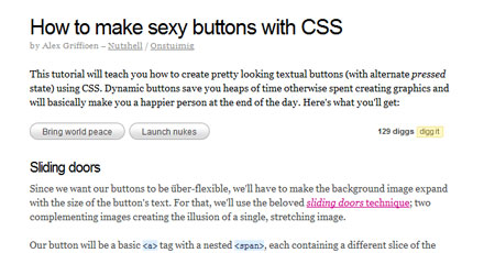
If you want Wii-like buttons, the article Simple Round CSS Links (Wii Buttons) provides all the necessary resources and explanation on how to style them.
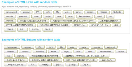
The common way to achieve the CSS sliding doors technique is to use two images. However, the article CSS Sliding Door Using Only One Image shows that it is possible to achieve the same effect with only one image.
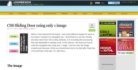
CSS Oval Buttons and CSS Square Buttons from Dynamic Drive are two other articles that show the effectiveness of CSS sliding doors.
CSS Sprites: One Image, Not Many
With CSS Sprites, one image file contains multiple graphic elements, usually laid out in a grid. By tiling the image, we show only one Sprite at a time. For buttons, we can include graphics for all three states in a single file. This technique is efficient because it requires fewer resources and the page loads faster. We all know that many requests to the server for multiple small resources can take a long time. This is why CSS Sprites are so handy. They significantly reduces round-trips to the server. They are so powerful that some developers use CSS Sprites for all their graphics. The Holy Sprites round-up on CSS Tricks offers some very creative solutions.
The example below shows the simplest use of CSS Sprites. A single image contains graphics for all three button states. By adjusting the background-position property, we define the exact position of the background image we want. The image we’re choosing to show here corresponds to a background position of top: -30px and left: 0.
![]()
a {
  background: white url(buttons.png) 0px 0px no-repeat;
}
a:hover {
  background-position: -30px 0px;
}
a:active {
  background-position: -60px 0px;
}
Useful Reading
In this easy-to-follow tutorial How to Build a Simple Button with CSS Image Sprites,” Chris Spooner explains how to create a CSS Sprites image in Photoshop and use it with CSS.
Transforming the Button Element With Sliding Doors and Image Sprites shows how to enrich a button element with a combination of sliding doors and image Sprites. It implements the active state in a very interesting way, not by using different images or colors but rather by positioning.