Designing CSS Buttons
Buttons, whatever their purpose, are important design elements. They could be the end point of a Web form or a call to action. Designers have many reasons to style buttons, including to make them more attractive and to enhance usability.
CSS 3: Buttons Of The Future
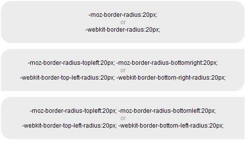
CSS 3 allows us to create visually rich buttons with just a few lines of code. So far, this is the easiest way to create buttons. The downside of CSS 3 is that it is currently supported only by Firefox and Safari. The upside is that buttons styled with CSS 3 degrade gracefully in unsupported browsers. By using the browser-specific properties -moz-border-radius (for Firefox) or -webkit-border-radius (for Safari), you can define the radius of corners. Here are a few examples of what can be done with the border radius property.
For better results, you can combine CSS 3 rounded corners with the background image property. The example below shows a typical button with a gradient image, the first without rounded corners, and the second with.
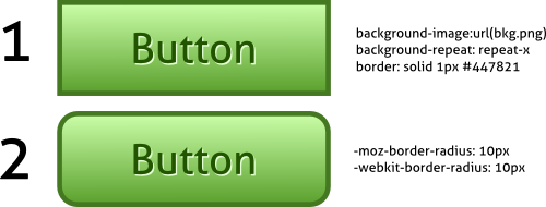
Compared to sliding doors, this technique is far simpler. However, if you want to maintain visual consistency across all browsers, then use sliding doors, because it works in all major browsers, including IE6. To learn more about the capabilities of CSS 3, read CSS 3 Exciting Functions and Features: 30+ Useful Tutorials.” And here are a few good tutorials on styling buttons with CSS 3 features.
Useful Reading
Super Awesome Buttons With CSS 3 and RGBA shows the power of CSS 3 with rounded corners, Mozilla box shadows and RGBA, which is a color mode that adds alpha-blending to your favorite CSS properties. This is one of the best examples of CSS 3 buttons.
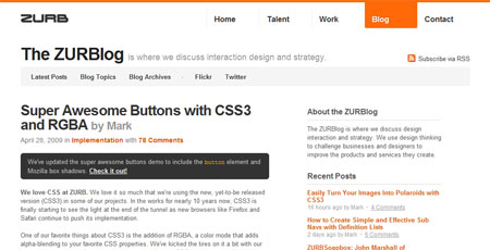
Create a CSS 3 Button That Degrades Nicely is a good example of CSS 3 buttons that degrade gracefully in browsers that don’t support CSS 3.

Creating buttons without Images Using CSS 3 explains the drawbacks of using images for buttons and shows several options for creating image-less CSS 3 buttons.
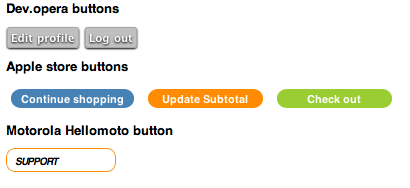
Emulating Google-Syle Buttons Using CSS 3 & dd_roundies JS is a fantastic article that shows how to create Google-like buttons. It goes even further and shows how to create the button pillbox commonly seen on Google pages.
Instant Tools: Are They Useful?
Tools exist for creating buttons, such as Easy Button and Menu Maker and My Cool Button, and for creating CSS Sprites, such as CSS Sprite Generator, but the question is, do they really help you create buttons that fit your needs. Although they are configurable and easy to use, your creativity and control over the results are limited, which makes for average-looking buttons. Using one-size-fits-all buttons is not a good idea.
The solution is to use Photoshop (or a free alternative) and the proven techniques described in this article. If you are a beginner with Photoshop, here are several excellent tutorials on creating amazing buttons.
If you don’t know where to start, iPhone-Like Button in Photoshop is the perfect choice. In only 10 to 15 minutes, you will be able to create the kind of buttons seen on the iPhone.

How to Create a Slick and Clean Button in Photoshop is a very detailed tutorial that guides you through 30 simple steps and helps you learn the Photoshop basics. In addition, the article explains how to use these graphics in combination with HTML and CSS to create fully functional CSS buttons.

Photoshop Button Maker is a fantastic tutorial from PSD Tuts that shows how to create fancy oval buttons (or badges).
Buttons And Usability: Instead Of Conclusion
The techniques described above can help you create stunning buttons. However, because they play a critical role in website usability, the buttons should meet some key principles:
- First consider the labeling. Always label buttons with the name of the action that the user is performing. And always make it a verb. A common mistake is to label buttons “Go” for various actions such as searching, sending email and saving. Labels should also be short and to the point; no need to clutter the user interface.
- As mentioned, include all button states (default, hover, active) to provide clear visual cues to the user as to what is happening. Button outlines should remain in the active state only.
- Clearly distinguish between primary and secondary actions. The most important action should be the most prominent. This is usually done by giving primary and secondary actions different colors.
- Pay close attention to consistency. Buttons should be consistent throughout a Web application, both visually and behavior-wise. Use CSS sliding doors for reused buttons or CSS 3 rounded corners to maintain consistency.
- Though obvious, we should note that the entire button area should be clickable.
The articles below provide even more usability guidelines and best practices for designing buttons.
10 Top Button Usability Mistakes is a short article that shows the worst mistakes one can make when creating buttons. Some of the mistakes are often seen on the Web.
Make Complete Button Surface Active and Enhance Usability is an in-depth article that shows mistakes in button design and that explains why the entire button surface should be clickable.
Creating Usable Links and Buttons explains why users expect buttons sometimes and links other times. It also shows how to choose between the two elements.
How to Design Buttons to Help Improve Usability explains some usability principles that should be considered when designing buttons. It covers the basics of icon usage, appearance, behavior, hierarchy and consistency.
Author: Janko Jovanovic
Janko Jovanovic is a software engineer, blogger and speaker focused on UI engineering. In his free time, he writes about UI engineering on his blog JankoAtWarpSpeed and tweets regularly on Twitter.