New CSS Techniques For Your Next Web Design
2. Page Layout
This is what CSS was built for. The options are almost endless, especially as CSS3 becomes the new standard.
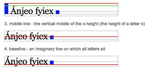
Aligning Inline Images with the Vertical-Align Property
The default vertical alignment for inline images in text sometimes looks not-so-great. This tutorial shows you how to better align inline images with your site’s type. It goes over the different types of vertical alignment and what they mean in relation to type.
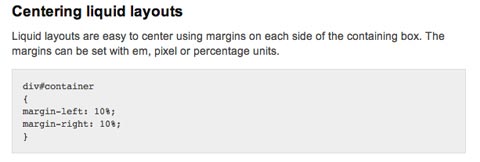
CSS Centering
This post includes instructions for centering liquid layouts with CSS. It’s very simple and straight-forward and works in virtually all browsers. Basically, it just uses left and right margins combined with some additional code to make it cross-browser compatible.
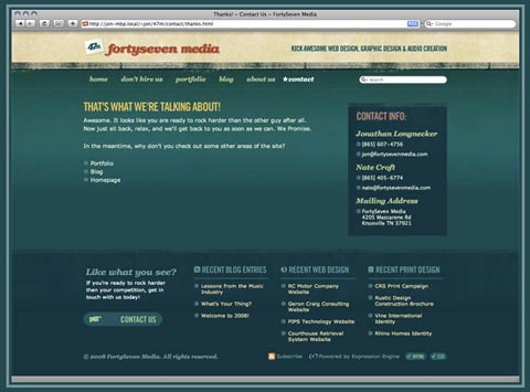
Making Your Footer Stay Put with CSS
Keeping footers at the bottom of your pages can be a real hassle with CSS, depending on how the rest of your page is set up. This tutorial shows exactly how to keep your footer where it should be—below the rest of your content! It’s a very thorough post, with complete, step-by-step instructions.
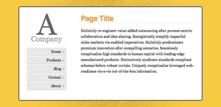
Vertical Centering with CSS
This post covers five excellent ways to center your content vertically. It includes the good and bad for each method along with complete instructions for implementing them. The methods range from using divs that act like tables to using absolute positions.
Handy Tips for Creating a Print CSS Stylesheet
This post is filled with great tips for creating better print stylesheets. It includes instructions for everything from including link destinations after the link text to splitting comments onto a new page. Pick and choose from the techniques offered or copy the whole stylesheet.
Fluid Images
Fluid layouts are great. They generally look and function just fine until you start introducing fixed-width elements within them—like images. This post shows how to make your images fluid, too. And it works for most embedded video. And while the basic technique includes just one CSS property, there is a workaround necessary to make it work on Windows machines.
Flexible Equal Height Columns
This tutorial shows how to create completely versatile equal height columns using valid and semantic markup. It’s cross-browser compatible and works with both fixed, fluid, and even elastic designs. It’s a very complete tutorial but not at all complicated.
CSS Columns with Borders
This is a technique for creating equal-height columns with CSS that have borders. It uses a series of nested divs to achieve the effect instead of images. The end result is fantastic.
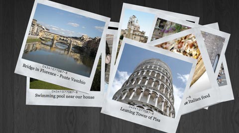
Creating a Polaroid Photo Viewer with CSS3 and jQuery
The photo gallery created with this technique is absolutely awesome. The HTML and CSS aren’t super-complicated, and everything is explained really well. While CSS3 isn’t supported by every browser, this does appear to degrade gracefully, making it perfectly fine to use as long as you don’t mind some visitors not getting the full effect.
A Killer Collection of Global CSS Reset Styles
An incredibly complete collection of global resets, this post covers pretty much every reset you could possibly need. Some are short and sweet, consisting of only a couple of properties, while others are very complete and reset everything you might consider resetting.
Making Module Layout Systems
This tutorial gives complete instructions for creating modular layout systems using CSS. This makes it practical to use different grid-based divs as needed for individual content elements. The end result provides tons of flexibility for dealing with everything from images to text while keeping everything uniform and balanced.
Multiple Backgrounds (CSS3)
This tutorial shows how to implement multiple backgrounds using CSS3. It’s currently only supported by Safari, but the tutorial includes tricks to make it work in non-supported browsers. Currently, it doesn’t validate, but once the CSS3 standard is completed it’s likely it will.
CSS3 Multiple Columns
Here’s a tutorial for creating multi-column layouts with CSS3. The CSS is pretty simple and straight-forward, much easier than most current solutions to multi-column layouts. Unfortunately, this only works with Firefox, Safari and Chrome at the moment.
Smart Columns with CSS and jQuery
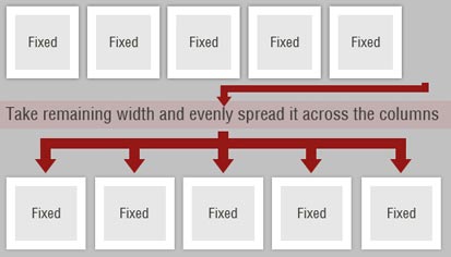
This tutorial shows how to create smart columns inside liquid layouts using a combination of CSS and jQuery. Basically, it fits as many columns into the base column size as possible and then distributes any leftover white space among the columns there. A very elegant solution if you want to allow for a variable number of columns without ending up with a bunch of leftover white space in your design.
CSS Hack for Chrome, Safari and Internet Explorer
This tutorial shows how to apply different style sheets based on the browser your visitors are using (at least in IE5-8, Google Chrome, and Safari 1-4). A very valuable technique if you want to use styles only supported in certain browsers without making your site look bad in unsupported browsers.
