Web Form Validation: Best Practices and Tutorials
Ideally, users will fill the web form with necessary information and finish their job successfully. However, people often make mistakes. This is where web form validation comes into play. The goal of web form validation is to ensure that the user provided necessary and properly formatted information needed to successfully complete an operation. In this article we will go beyond the validation itself and explore different validation and error feedback techniques, methods and approaches.
Validation feedback
If validation fails, the system should let the users know it by providing a clear and unambiguous message (usually one or two sentences) and ways to correct errors. Since users need to notice an error message immediately, it is a good practice to position it at the top of a web form, before all the other fields. This will also allow screen readers to easily access the message.
The message should be shown preferably in red since this is the color that people usually associate with errors and it should contain an appropriate icon in order to get more attention. Icon should be globally recognizable, such as a red circle with white cross. This will also help people with visual impairments identify the meaning of the message. In addition to this, users should be informed about which input fields need to be checked.

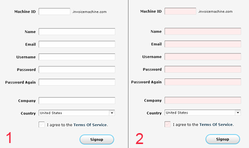
The Invoice Machine Sign-up form doesn’t provide error feedback. Error message is missing and input fields are colored with pastel red that is not easy to spot.
Apart from the error message and a list of invalid fields, the system should clearly mark fields that are invalid. This can be done in one of the following ways (or any combination of them):
- By providing red inline messages or markers next to every invalid field
- By changing the background color or border color of invalid fields (to red)
- By changing the color of field labels
- By providing error tips (balloons) next to each field
If you provide error tips or help, be short and informative. For example, if date is in an incorrect, format provide users with details on how to format it properly: “The date should be in the dd-mm-yyyy-format”. It is sometimes also a good idea to have these hints as the initial value of your input fields. Thus, the user will first read the hint inside the input box and when he/she will start typing the data, the hint will disappear.
Validation upon submit
The “classic” way to perform validation is when the user submits his data via the “submit”-button. The validation is executed and if any errors are found, feedback is returned and displayed to the user. This way users will be able to fill the form without any interruptions. But, that could be a disadvantage as well. Users will be able to fix the errors only after they try to submit the form and get the response back from the server. This technique is typical for server-side validation, but can also be done on the client side.

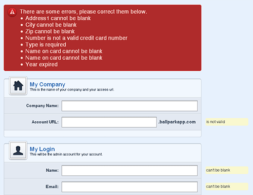
Feedback on Ballpark sign-up form occurs upon submit. It shows an obvious error message with incorrect fields at the top of the form and marks each incorrect field with a tip.
Real-time validation (or instant validation)
In contrast to the previous technique, real-time-validation alerts users while they are filling in the form. That doesn’t necessarily mean that the validation is performed on every single key press but rather when a field loses focus. This way users will get immediate feedback about their input, e.g. if a username is available or if a date is in the correct format. Obviously, instant validation occurs during typing in an input field or after the input field loses focus. Usually, it is complemented with a text message, tip or a status icon.

Yahoo registration form implements password strength meter that gives feedback as you type in the letters.
Instant validation should be implemented carefully and in appropriate cases because it might be distracting if overused or misused.

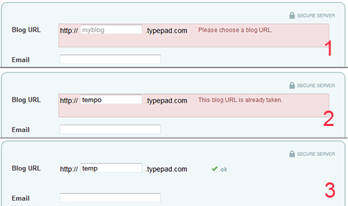
Sign-up form on TypePad not just provides instant validation feedback that informs users of different validation errors – it also indicates successfully entered information.
What to avoid?
There are two things you should really try to avoid when designing form validation. First, single error pages are bad practice. Singe error page means that users are redirected from the Web form they filled to a page that shows some feedback. In this case, users are forced to browse back in order to fix errors. When they browse back they will have to memorize the information you provided in the error message. The same applies to feedback messages in popup windows. Not only are popups annoying, but once they are closed all the feedback is lost.
An interesting finding in the second part of SM survey is that “30% of the forms displayed only an error-message at the top of the form (no input fields were highlighted)” while “29% had highlighted input fields with corresponding messages next to the input field (no error-messages were provided at the top of the page)”. Only 25% used both error-messages and input fields.
Probably the most surprising facts are that 14% of sites still use JavaScript popup for showing validation feedback, while Ajax validation is present only on 22% of sites. This shows big variations in validation feedback.