Web Form Validation: Best Practices and Tutorials
Ideally, users will fill the web form with necessary information and finish their job successfully. However, people often make mistakes. This is where web form validation comes into play. The goal of web form validation is to ensure that the user provided necessary and properly formatted information needed to successfully complete an operation. In this article we will go beyond the validation itself and explore different validation and error feedback techniques, methods and approaches.
Better safe than sorry
Apart from the pure validation, there are several techniques that can help users make fewer mistakes. Although not all of these techniques can be considered validation, they do help by guiding users and preventing them from making mistakes.
Help hints
If a web form requires complex information to be filled in, help hints can significantly help users in the process of filling in the correct information. By guiding them how to fill particular information, you let them fill the form faster and avoid potential validation errors. Help hints are usually shown as simple text next to or above the input field. The design of help hints should differ from the design of form labels. It is usually shown in smaller, grayed text. The advantage of help information is that it is always visible to the user even if JavaScript is turned off.
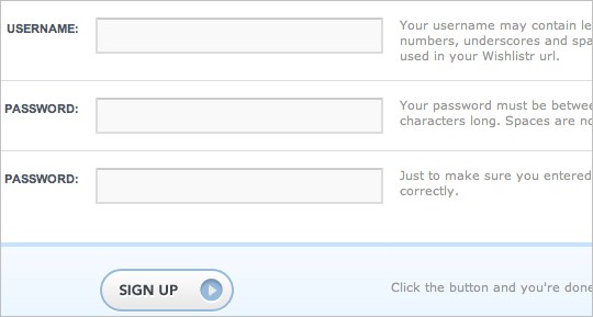
WishListr provides useful help information on the right side of each field.
Help indicators (tooltips)
In contrast to help hints, tooltips initially hide information and make it visible “on demand”. They are usually triggered by an icon with a question mark. Help information is shown by hovering over the help icon or clicking on it. Once the mouse is moved away from the icon, the tooltip disappears. Help indicators can reduce clutter, especially if help text is too long.
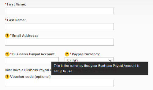
Sign-up form on TicketTrunk contains obvious help indicators that provide help information on hover.
Dynamic tips
Similar to the previous case, dynamic tips are initially not visible to users. Once the user enters a particular input field, related tip is shown. This way tips are emphasized and clutter in the form is reduced. Tips should be shown in such a way that they don’t cover other information on the form. They are usually shown next to input fields, but you should always try to place them on the right side of the fields since that is less distracting.
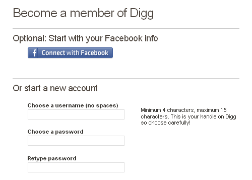
Digg registration form has discrete dynamic tips that show help information related to the field that has the focus.
Masking and reformatting user’s input
Apart from validating user’s input and assisting users, web applications can also take part in providing correct data by formatting user’s input. This can be done by masking input fields in order to force users to enter information in an appropriate format. Mask is an expression that controls what users can enter in an input field. Masking can be implemented easily with one of the following plugins:
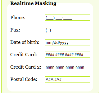
Typecast demo page shows different masking options.
In some cases users might fill partially correct information or correct information but in different format. In those cases web application can provide a mechanism to correct and rewrite the user’s input. Some of the possible scenarios when you might consider rewriting user’s input are:
- if, for instance, a user enters URL without “http://” prefix, the system can just add this string to the beginning of URL.
- if a user provides data in the dd-mm-yyyy-format, but the required format is yyyy-mm-dd, the system can rewrite the date so it is well-formed
- if a user provides credit card number without dashes, the system can add dashes to appropriate positions in the credit card number
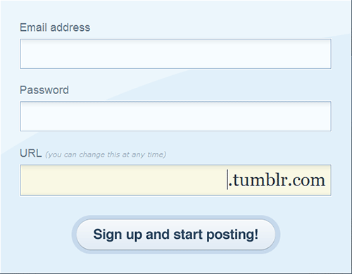
Tumblr provides a sort of masking for URL.
These ideas are just some of the cases when this technique can be used. However, auto-formatting should be used carefully and – if not used properly – can be confusing to users. Also, not all user’s input is predictable. If, for example, user enters “www.smashingmagazine” and omits the extension, the system can’t assume that the extension is “.com”, but should rather raise a validation error.
In this context it’s again worth mentioning the “forgiving format” design pattern. Instead of restricting user’s input to a specific format you can allow users to provide various formats and let the system parse it. In many cases this would require a lot of server processing; back-end would be responsible for parsing the input, extracting information and converting it to appropriate formats for further processing.

Google Calendar has a very clever implementation of this technique with one-field for adding events. Users can enter information in various formats (even use “tomorrow” instead of date); the system parses it and stores it as a new event. If user provides information that can’t be parsed, system assumes that this information is event title and redirects the user to a longer version of the form with filled event name. This way Google completely omitted validation.
According to our survey. 67% of sites use help text and tips, 10% of which use dynamic tips. Surprisingly, only 26% of tips are positioned on the right side of the fields, while in other cases tips are positioned above, below and even on the left side of input fields.