Mystery Of The CSS Float Property
Clearing Floats
Layout issues with floats are commonly fixed using the CSS clear property, which lets you “clear” floated elements from the left or right side, or both sides, of an element.
Let’s take a look at an example that commonly occurs — a footer wrapping to the right side of a 2-column layout:

If you view this page in IE6 or IE7, you won’t see any problems. The left and right columns are in place, and the footer is nicely tucked underneath. But in Firefox, Opera, Safari, and Chrome, you’ll see the footer jump up beside the left column. This is caused by the float applied to the columns. This is the correct behaviour, even though it is a more problematic one. To resolve this issue, we use the aforementioned clear property, applied to the footer:
#footer {
	clear: both;
}
The result is shown below:

The clear property will clear only floated elements, so applying clear: both to both columns would not cause the footer to drop down, because the footer is not a floated element.
So use clear on non-floated elements, and even occasionally on floated elements, to force page elements to occupy their intended space.
Fixing the Collapsed Parent
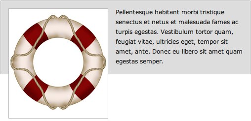
One of the most common symptoms of float-heavy layouts is the “collapsing parent”. This is demonstrated in the example below:

Notice that the bottom of the floated image appears outside its parent. The parent does not fully expand to hold the floated image. This is caused by what we discussed earlier: the floated element is out of the natural document flow, so all block elements will render as if the floated element is not even there. This is not a CSS bug; it’s in line with CSS specifications. All browsers render the same in this example. It should be pointed out that, in this example, adding a width to the container prevents the issue from occurring in IE, so this would normally be something you would have to resolve in Firefox, Opera, Safari, or Chrome.
Solution 1: Float the container
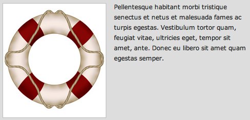
The easiest way to fix this problem is to float the containing parent element:

Now the container expands to fit all the child elements. But unfortunately this fix will only work in a limited number of circumstances, since floating the parent may have undesirable effects on your layout.
Solution 2: Adding Extra Markup
This is an outdated method, but is an easy option. Simply add an extra element at the bottom of the container and “clear” it. Here’s how the HTML would look after this method is implemented:
<div id="container">
<img src="/images/css-float/lifesaver.jpg" title="" alt="" />
<p>Pellentesque habitant morbi tristique senectus et netus et malesuada fames ac turpis egestas. Vestibulum tortor quam, feugiat vitae, ultricies eget, tempor sit amet, ante. Donec eu libero sit amet quam egestas semper.</p>
<div class="clearfix"></div>
</div>
And the resulting CSS applied to the new element:
.clearfix {
	clear: both;
}
You could also do this by means of a <br /> tag with an inline style. In any case, you will have the desired result: the parent container will expand to enclose all of its children. But this method is not recommended since it adds nonsemantic code to your markup.
Solution 3: The :after Pseudo-Element
The :after pseudo-element adds an element to the rendered HTML page. This method has been used quite extensively to resolve float-clearing issues. Here is how the CSS looks:
.clearfix:after {
    content: ".";
    display: block;
    height: 0;
    clear: both;
    visibility: hidden;
}
The CSS class “clearfix” is applied to any container that has floating children and does not expand to enclose them.
But this method does not work in Internet Explorer up to version 7, so an IE-only style needs to be set with one of the following rules:
.clearfix {
	display: inline-block;
}
.clearfix {
	zoom: 1;
}
Depending on the type of issue you’re dealing with, one of the above two solutions will resolve the issue in Internet Explorer. It should be noted that the zoom property is a non-standard Microsoft proprietary property, and will cause your CSS to become invalid.
So, because the :after pseudo-element solution does not work in IE6/7, is a little bit bloated code-wise, and requires additional invalid IE-only styles, this solution is not the best method, but is probably the best we’ve considered so far.
Solution 4: The Overflow Property
By far the best, and easiest solution to resolve the collapsing parent issue is to add overflow: hidden or overflow: auto to the parent element. It’s clean, easy to maintain, works in almost all browsers, and does not add extra markup.
You’ll notice I said “almost” all browsers. This is because it does not work in IE6. But, in many cases, the parent container will have a set width, which fixes the issue in IE6. If the parent container does not have a width, you can add an IE6-only style with the following code:
// This fix is for IE6 only
.clearfix {
	height: 1%;
	overflow: visible;
}
In IE6, the height property is incorrectly treated as min-height, so this forces the container to enclose its children. The overflow property is then set back to “visible”, to ensure the content is not hidden or scrolled.
The only drawback to using the overflow method (in any browser) is the possibility that the containing element will have scrollbars or hide content. If there are any elements with negative margins or absolute positioning inside the parent, they will be obscured if they go beyond the parent’s borders, so this method should be used carefully. It should also be noted that if the containing element has to have a specified height, or min-height, then you would definitely not be able to use the overflow method.
So, there really is no simple, cross-browser solution to the collapsing parent issue. But almost any float clearing issue can be resolved with one of the above methods.