Do’s and Don’ts of Dark Web Design
Dark web designs are very popular and can have an elegant and creative appeal.They are also perfect for many types of client work however, they are not suitable for every website and should be used only when appropriate.In spite of the striking visual impact that these dark designs can have, many designers don’t know how to effectively pull them off without turning off the visitor.
With a dark design comes less readability, less appeal for most readers and less opportunity for conventional design elements.
A recent poll suggests that light designs are preferred by the general web-going audience by a whopping 47%. The main reason is readability. Most people don’t like viewing light text against a dark background on websites because it strains their eyes, making for a much less enjoyable experience.
By contrast, 10% of those surveyed said that they always preferred dark backgrounds for websites, while another 36% said that the best choice would depend on the type of website.
So, what’s the right answer? When it comes down to it, everyone has their own opinion, and that’s that.
But with such a large percentage of users saying that dark website designs are tolerable and sometimes even preferred, we as web designers have to learn how to create effective dark designs for ourselves and our clients.
This means convincing all of the true believers of light backgrounds that dark design can be more readable and user-friendly.
Use More White Space
Or should it be called “black space”? Effective use of white space is important for any type of design, but it is essential for websites with dark backgrounds.
Dark designs have a tendency to feel “heavy”, and cluttering them up can reinforce that feeling. Take a look at some popular dark web designs below, and note their liberal use of white space to great effect.
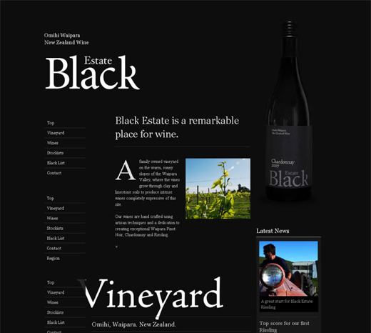
Black Estate is seen all over the Internet in dark web design showcases. It is indeed a beautiful design and worthy of all the attention. A great deal of white space is used throughout the design, and what makes this particular design unique is how the white space is used to outline certain elements so efficiently.
The logo has a lot of white space around it and is the first thing we see as visitors. We see the main content and bottle on the right next. As you see, white space is used perfectly to highlight the text on the bottle and the headline of the main content.
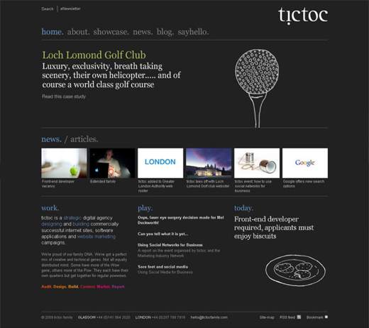
The featured content in Tictoc and accompanying image in this design are framed with the most white space. As we move down, we see less white space, which makes us pay attention to the content being shown.
The point here is that white space gradually guides the user down to the end of the page.
The dark background adds depth to the design. Because the website relies so heavily on white space, it would be less interesting without the creative effect of the dark background.
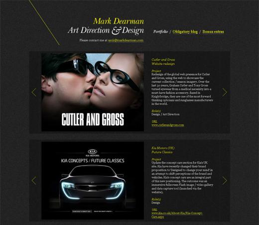
The Mark Dearman website has liberal and evenly distributed white space throughout its layout.
The white space framing each portfolio piece provides plenty of breathing room for the content it holds, and it is a nice resting point before moving on to the next piece.
Plenty of white space is essential to dark designs because it aids not only in de-cluttering the layout but in framing important elements and adding elegance to the overall look.