Do’s and Don’ts of Dark Web Design
Use Minimal Color Schemes
To give their dark designs a clean and uncluttered look, designers should always opt for minimal color schemes.
From the few examples below, we can see that busy color schemes really get in the way of dark backgrounds, because the contrast is too sharp.
Stick to one or two colors. To add more color, try a dark-colored background.
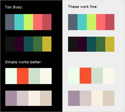
Granted, many dark web designs have more exciting color schemes. So this rule is often broken, but only with the right techniques.
In general, though, color is often what makes a website look too busy. Because darker websites already have depth, use color with caution.
Offer a Style Switcher
While we have many good practices at our disposal to make dark web designs more appealing, no amount of effort will satisfy every user.
Be sure to include a style switcher, so that users ultimately have the option of viewing dark text on a light background.
Two style sheets are required for this, one for the default dark layout, and one for the alternative light layout.
SitePoint has an excellent tutorial on this: Build a Simple Style Switcher in CSS. Instead of using the “orange,” “blue” and “white” versions in the tutorial, just use “light” and “dark” style sheets.
When Dark Web Design Works Best
As stated, a large proportion of web users believe that a dark web design could work for certain types of websites. But the study is vague on what exactly these types are.
Generally speaking, dark works best for creative or elegant designs. For modern sleek websites, dark backgrounds add elegance. For grungy or hand-drawn styles, dark backgrounds enhance the creativity of the layout.
Elegant Dark Design
Dark can be deep, authoritative and strong, and often looks elegant when used appropriately. Here are a few examples and some techniques for bringing out the elegance in a dark design.
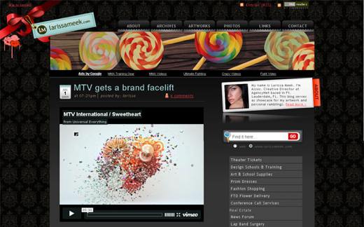
The website for Larissa Meek has a simple vintage-style pattern in the background, setting an elegant tone. Other quirkier features add a personal touch to the design.
This technique can be used for many kinds of websites. Vintage or classic patterns and textures can create a look that is both elegant and age-appropriate.
Most of us associate vintage patterns with high class, so creating a high-class website in this way is easy.
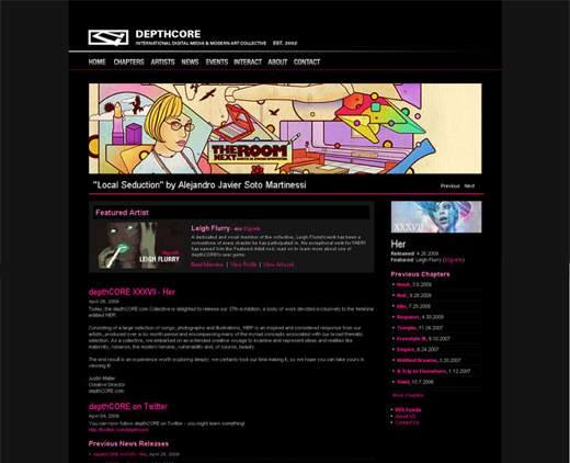
Depth Core has a very clean design, with a dark background that adds style and class. A sense of authority is also evident in the design. This elegance may also make a designer’s portfolio work appear more valuable as a result.
Note that this design has no texture or images other than the portfolio pieces and logo. Otherwise, the design would have been far too busy; as it is, the content is knit together well.
A good process to follow is to add essential content first and then bring in design elements as needed. The designer can then pause and reflect as each new element is added, making sure the layout is not being over-powered.
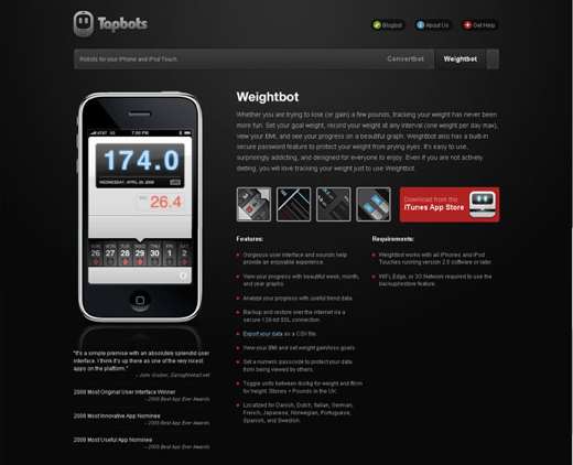
Just as artwork can appear more valuable in an elegant design, so can products. A dark and sleek design, like Tapbots and so many others, helps showcase the product being sold.
The design reflects the device itself, with its gradients and lighting effects; some designs even mimic the texture of their high-tech products.