Do’s and Don’ts of Dark Web Design
Textual White Space
Because readability is the number one concern of those who dislike dark backgrounds, designers must pay extra close attention to the text itself.
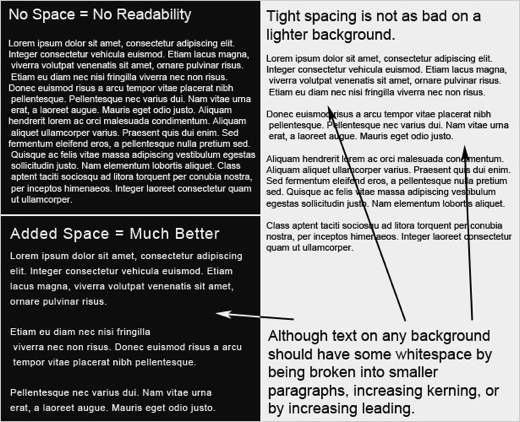
Just as in the overall design, one way to improve readability on dark websites is to increase the white space by adjusting paragraph size, kerning and leading.
The example below shows what a difference the spacing between and around characters makes in comparing dark and light layouts.
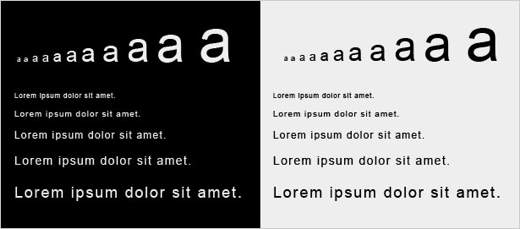
Another way to improve readability in dark web designs is to increase the font size. Like most of the other rules in this post, larger font sizes mean more white space. The bigger the letters are, the more white space will appear around and within each letter.
For example, the letter “a” below gets more white space as it gets larger, both in the area around it and in the space inside the a’s enclosure and under the overhang.
Note how reading small text is so much easier on a light background than on a dark one. When setting the typography for a new website, be sure to look at some dummy text to make sure it is legible. If not, see if increasing the text size helps.
Text Contrast
Many people would agree that the most poorly conceived dark websites cause eye-strain. Too much or too little contrast is usually the culprit. How does one find the perfect balance?
If you are in a room that is pitch black, suddenly looking directly into light is not pleasant. But looking at a less bright light in a less dark room is just fine. The same principle applies to web design.
Finding the perfect contrast means balancing the darkness of the background with the lightness of the text.
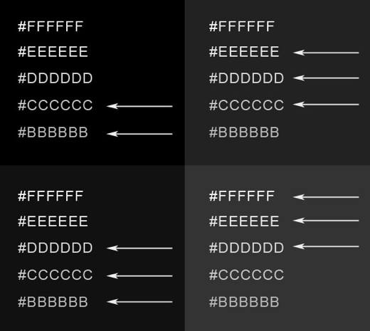
Below is a (very) rough guide that shows how contrast between text and background works. One notices that as the background gets lighter, so does the text.
Finding a pleasant contrast for text is much more difficult with a pure black background.
To find the perfect balance, experiment with different shades. The best result is usually a background that isn’t pure black and text that isn’t pure white.
Dealing with Fonts
Fonts plays a big role in design and should definitely be taken into thoughtful consideration with dark layouts. The image below shows a 14 point font on a dark background in both serif and sans-serif fonts.
The sans-serif font is obviously more legible. But many designers still choose serif fonts for their elegance.
The trick, though, is to put only larger text in serif fonts, so that the extra white space floods around each character and makes the text very legible.

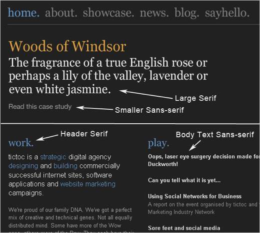
The screenshot below is of a website discussed earlier in this article. It features both serif and sans-serif fonts, but uses them in a smart way.
Larger text, such as headlines, navigation and headers, is in a serif font for added elegance. For better contrast and improved readability, the body text is in a clean sans-serif font.