Do’s and Don’ts of Dark Web Design
Creative Dark Design
Beyond just appearing elegant, dark website designs can also elicit more emotional responses than standard light designs, making them ideal for creative projects. Let’s look at some examples of the kinds of creative designs that are possible.
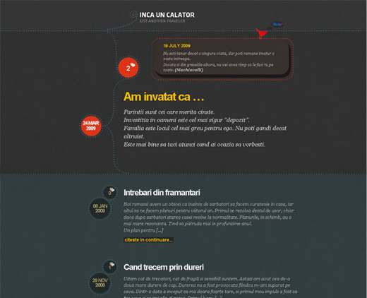
The site below has very little content but has a unique layout and dark colors for depth. Dark backgrounds are perfect for websites with very little content.
And because they require more white space, the designer has more room to work with.
Grunge web design comes in many forms, and because grunge is “dark and dirty,” dark backgrounds are one of those forms.
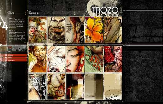
Dark grunge designs like Trozo seem to break all the rules: busy textures, crowded layout and a wide range of colors. And yet this website still works. How is that possible?
With so many messy elements to work with, grunge design can be tricky for beginners. What makes this one work is its organization.
The background has clearly laid-out blocks that guide the user’s eye and help divide the content into manageable sections.
Secondly, it has a ton of white space. The background may be textured, but the repeated pattern is seen by the user as white space, helping to lighten the design.
This white space is most apparent to the left of the logo, under the navigation and along the right side.
Even between “Exhibit 01″ and “Exhibit 02″ is more white space than one would usually find on a website like this.
The white space evens things out, even though it doesn’t look like white space because it has texture. The minimal text and few sections (only three) also contribute to this appearance of simplicity.
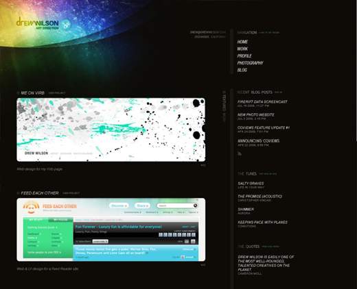
The design of Drew Wilson definitely breaks the rule of using minimal color. It still works, though, because the brightly colored header is one of the few features in this sparse design, so nothing over-powers it.
And the dark background makes the header appear even brighter and more extraordinary.
Dark backgrounds are often used to make lighting effects and bright colors stand out more.
Such designs are a wonderfully creative exception to the rule of minimal color. But the rule should be broken with caution: avoid distracting gradients, textures and color further down the page.
Wrapping Up
Dark backgrounds give an elegant and creative feel to web designs, making them perfect for some portfolios, but they’re not suitable for every site.
For larger websites, especially ones for people with visions impairment and other disabilities, dark designs are a no-no, even with a style switcher.
Hopefully when the time comes that you need to design a website with a dark background, these tips and strategies will help.